MNTN Select.
From a single conversation with the CEO to a marketplace where major networks and exchanges now sell premium TV inventory, and advertisers buy it themselves.
Premium TV was hard to buy and hard to sell.
Premium connected-TV inventory, such as live events and popular shows, has traditionally been locked behind upfront commitments. Networks struggled to sell it consistently, and advertisers couldn't buy the specific shows they wanted without committing months ahead.
Select gives advertisers a programmatic, retail-like way to buy show-level inventory with flexible budgets, and gives networks a way to list and sell it, either through their existing SSPs or directly into MNTN.
The design challenge was serving two audiences at once. Advertisers wanted to find the specific shows that fit their brand, see a clear price, and buy without a commitment made months ahead. Networks wanted a way to list inventory that might otherwise go unsold, through their existing SSPs or directly with MNTN, without adding to their selling effort.
The experience had to feel as simple as shopping online, while handling real complexity underneath: bundles of programs, sale periods and air dates, budgets that turn into impressions, and audience targeting.
Design came first. The product followed.
The project started with just my team, mostly me, designing, because the timeline was tight. I created the full design and UI from a single conversation with the CEO, before the product and engineering teams were in place.
When the CEO started showing the designs, the feedback was overwhelmingly positive. They became his tool for winning buy-in from investors and from networks including Warner Bros., NBC, AMC, Disney, and Paramount, and they gave me carte blanche on the design.
From there the project took off. Engineers were assigned to me, starting with one and scaling to about 12 today. I led the front-end work to get a working proof of concept running within the first three months. Once it worked, we began integrating with the premium TV platform and the publishers.
One system, three aesthetics.
I built a dedicated design system for Select, one of six I've built in my career. It lets me prototype and complete features rapidly, and it supports multiple themes so it can adapt to the different aesthetics MNTN supports. Color shows how it works: raw ramps feed a themed core palette, and the theme decides how everything looks. The system holds to WCAG 2.1 AA.
View the system in Figma (access required)Full 50–900 ramps for every hue. The raw material.
The themed palette: shades, surfaces and tones, accents, status colors, and gradients, each with a usage rule. Colors adapt to the theme that is set.
Primary, Contrast, and Slate remap the core palette, so the same UI adapts to the aesthetics MNTN supports.
A storefront for show-level TV inventory.
Scroll inside each screen to explore the full page.
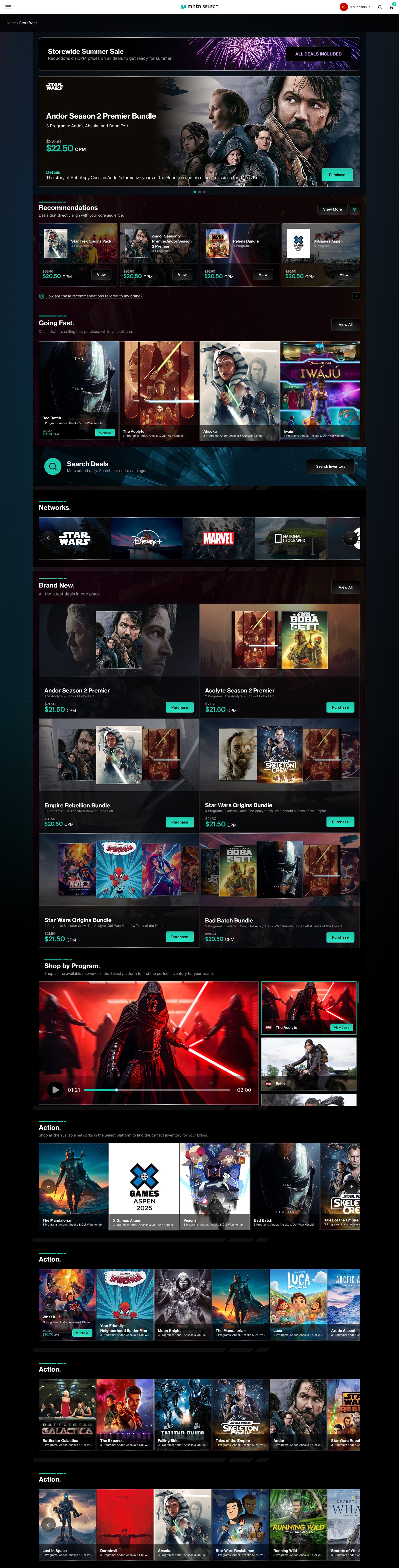
The home page leads with a featured sale, then personalized recommendations, a "Going Fast" row, a network carousel, the newest deals, and shop-by-program rows.
Why: Select's pitch is a retail-like way to buy TV, so the storefront borrows from retail: a featured sale up top, recommendations matched to the buyer's audience, urgency in "Going Fast," and rows by network and program. Buyers can start from a brand they know, a show they want, or a deal.
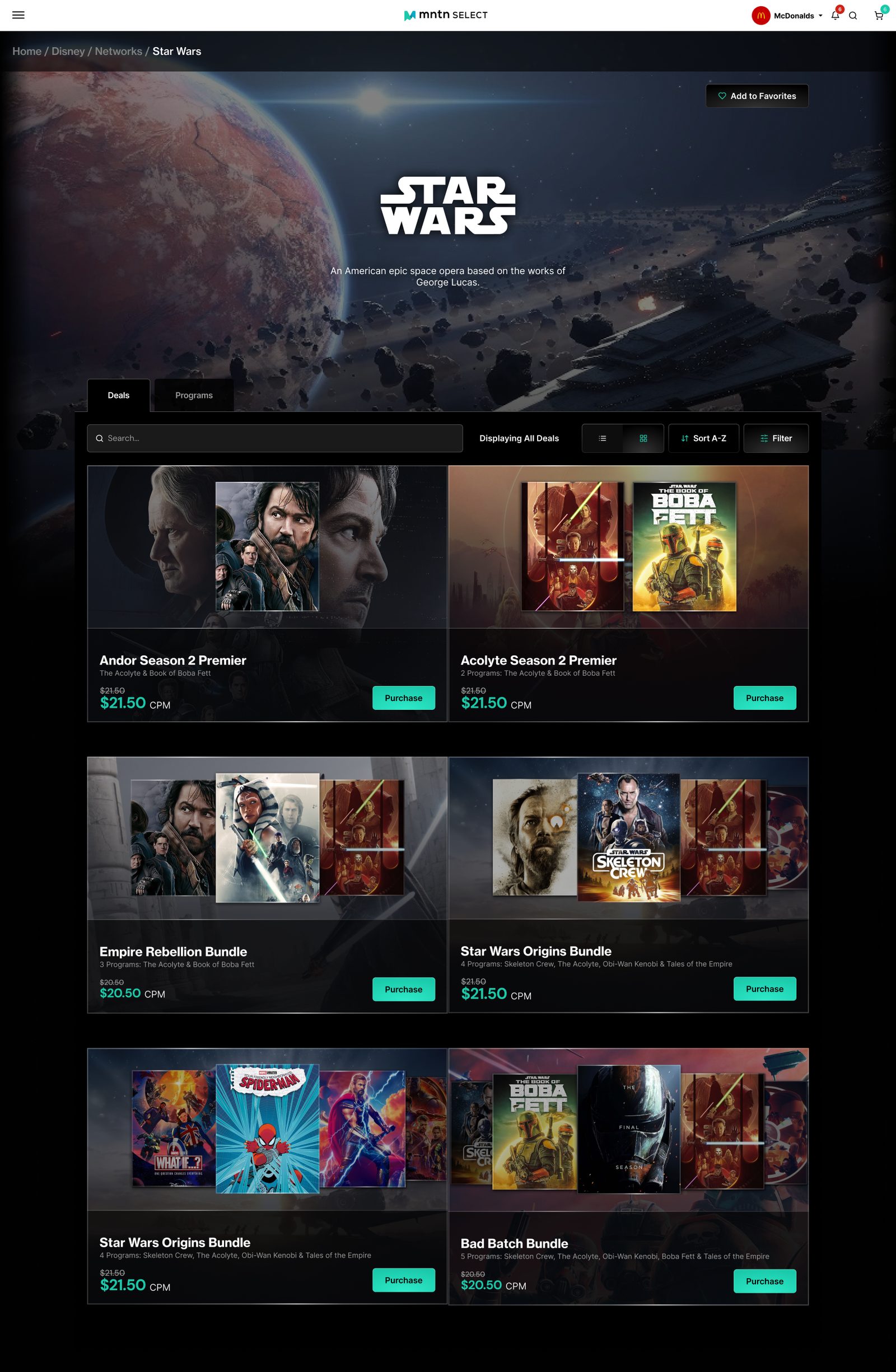
Deals and Programs tabs, search, list and grid views, sorting, and filters. Each card shows the programs bundled in the deal and the CPM price, with the original price struck through.
Why: Buyers often start from a network they know. The page puts deals first because deals are what they purchase, and keeps programs one tab away. Each card shows the bundled programs and CPM price together so buyers can compare without opening every deal, and the breadcrumb makes the parent company, network, and program hierarchy clear.
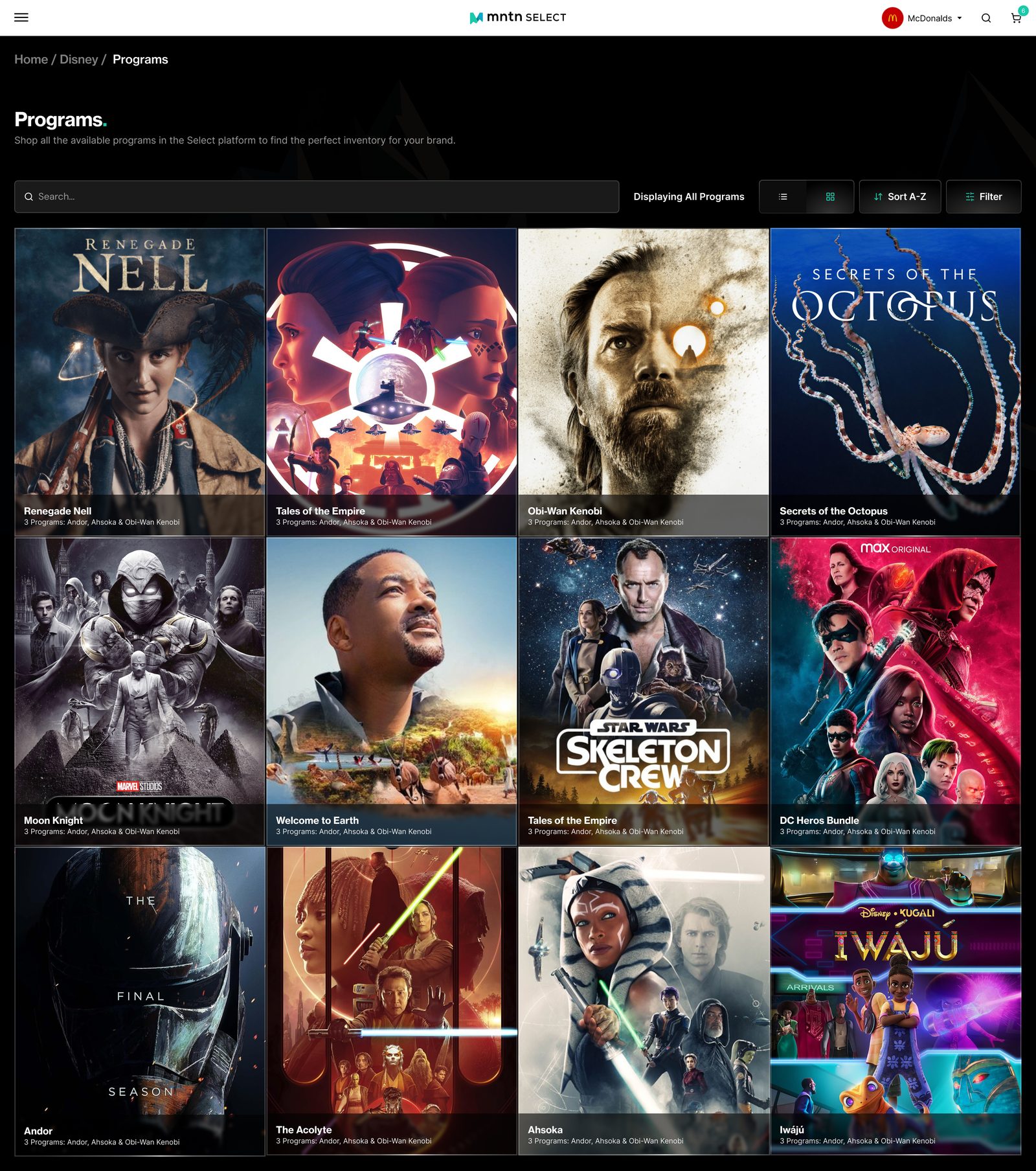
A poster grid of every available program, with the same search, sort, filter, and view controls, so the way you browse stays consistent across the platform.
Why: For buyers who think in shows rather than bundles, a poster-led catalogue makes inventory feel like TV instead of a rate card. Reusing the search, sort, filter, and view controls from the network page keeps browsing predictable across the platform.
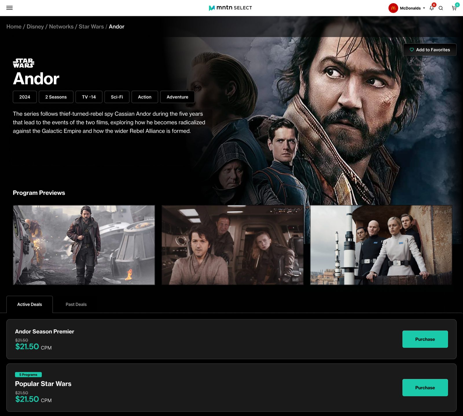
Key art, year, seasons, rating, and genres, plus program previews. Active and past deals sit below with CPM pricing and a one-click purchase.
Why: Premium TV is bought on the strength of the show, so the page leads with key art and facts, then previews so buyers can judge the content. Purchase options sit directly below, which keeps the path from interest to purchase short.
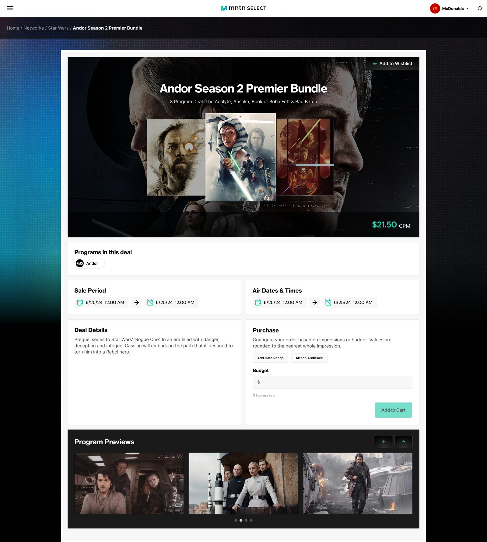
Programs in the deal, sale period, and air dates sit beside a purchase panel. Buyers set a budget and see impressions, add a date range, attach an audience, and add to cart.
Why: This is where the buyer commits, so it's the most structured page: what's included, when it's on sale, when it airs, then one panel to configure the buy. Budget turns into impressions in place, so buyers see what their money gets before they add to cart.
AI planning, campaign setup, and reporting.
Later phases of the product, for buyers and for networks. Scroll inside each screen. Accounts and data shown are demo content.
A chat panel asks about goals, timing, and budget, then builds a suggested purchase beside it: deal cards with CPM and swap, refresh, and remove controls, estimated households, total impressions, and a Purchase button.
Why: Media planning is a long list of decisions, so the assistant asks one question at a time and shows the plan taking shape next to the conversation. Every deal can be swapped or removed, so buyers stay in control.
Read the FlightPlan case study →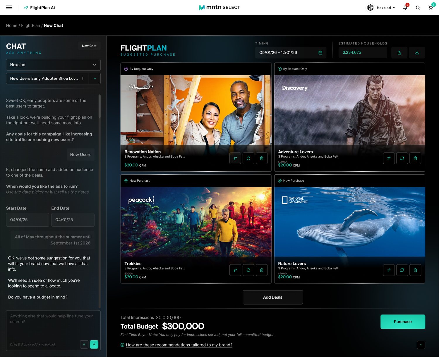
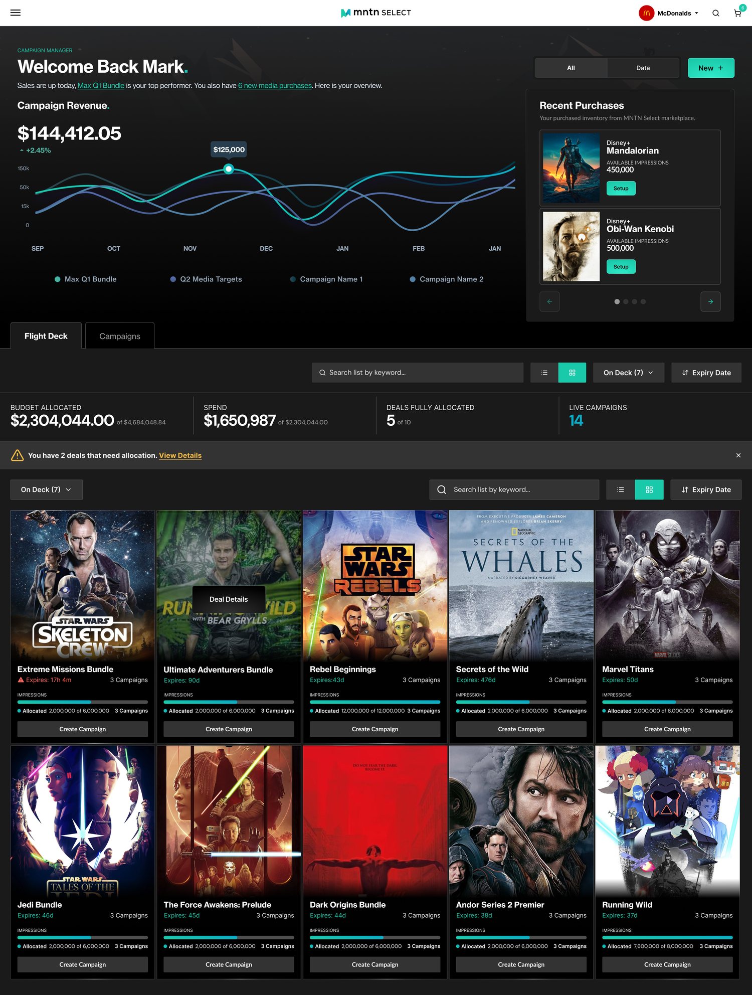
A revenue chart and recent purchases sit above a Flight Deck of deals. Budget allocated, spend, fully allocated deals, and live campaigns are summarized, and a banner flags deals that still need allocation.
Why: After buying, the job is allocating impressions before deals expire, so the page surfaces what is urgent: expiry times, allocation progress, and a one-click Create Campaign.
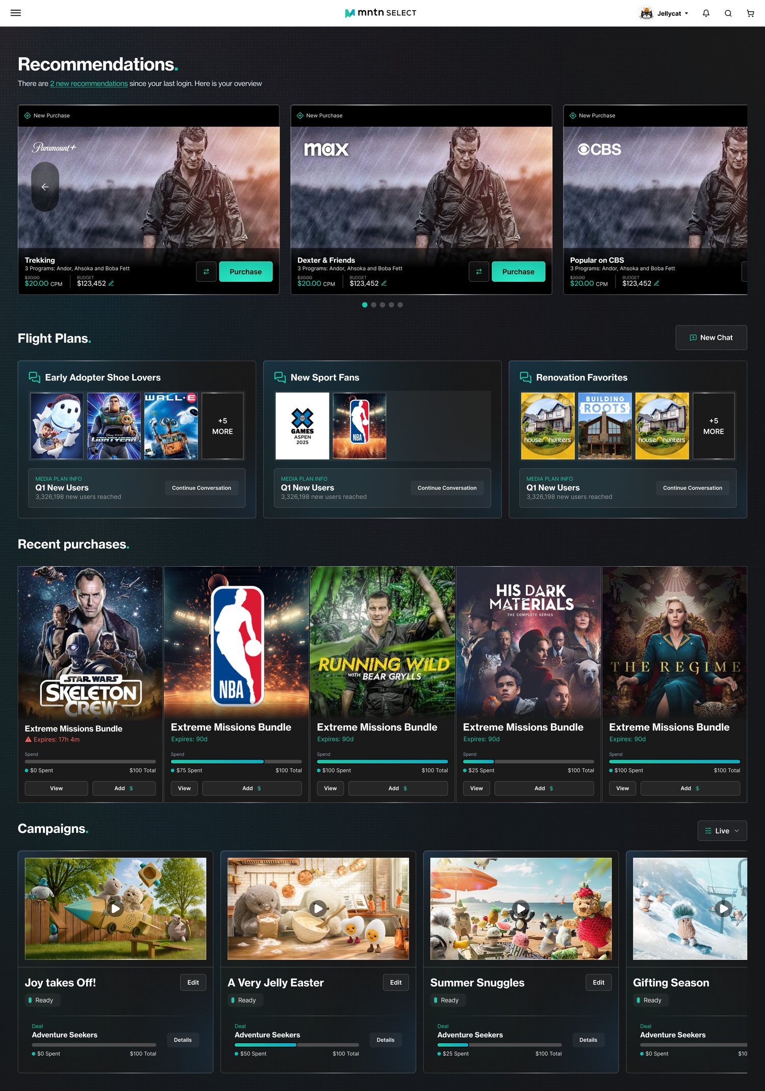
Recommended purchases, saved flight plans grouped by audience, recent purchases, and live campaigns share one home page, each with a clear next action.
Why: Returning buyers usually want to pick up where they left off, so the page leads with fresh recommendations and unfinished conversations before anything else.
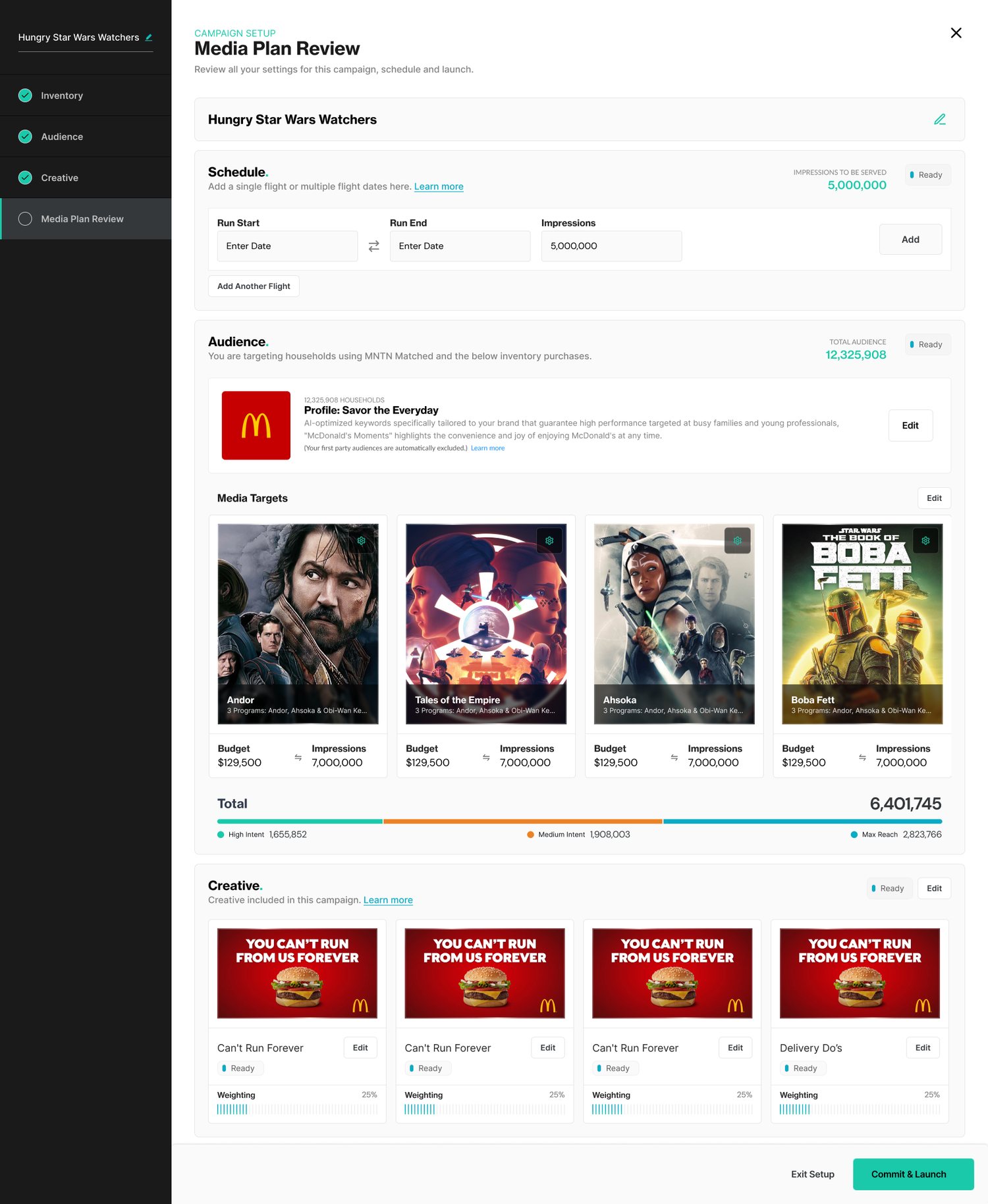
A stepper tracks inventory, audience, creative, and media plan review. The review page summarizes the schedule and flights, the audience, media targets with budget and impressions, and creative weighting, and ends with Commit & Launch.
Why: Launching is the highest-stakes moment, so everything the buyer set up appears in one place, editable in place, with plain status labels.
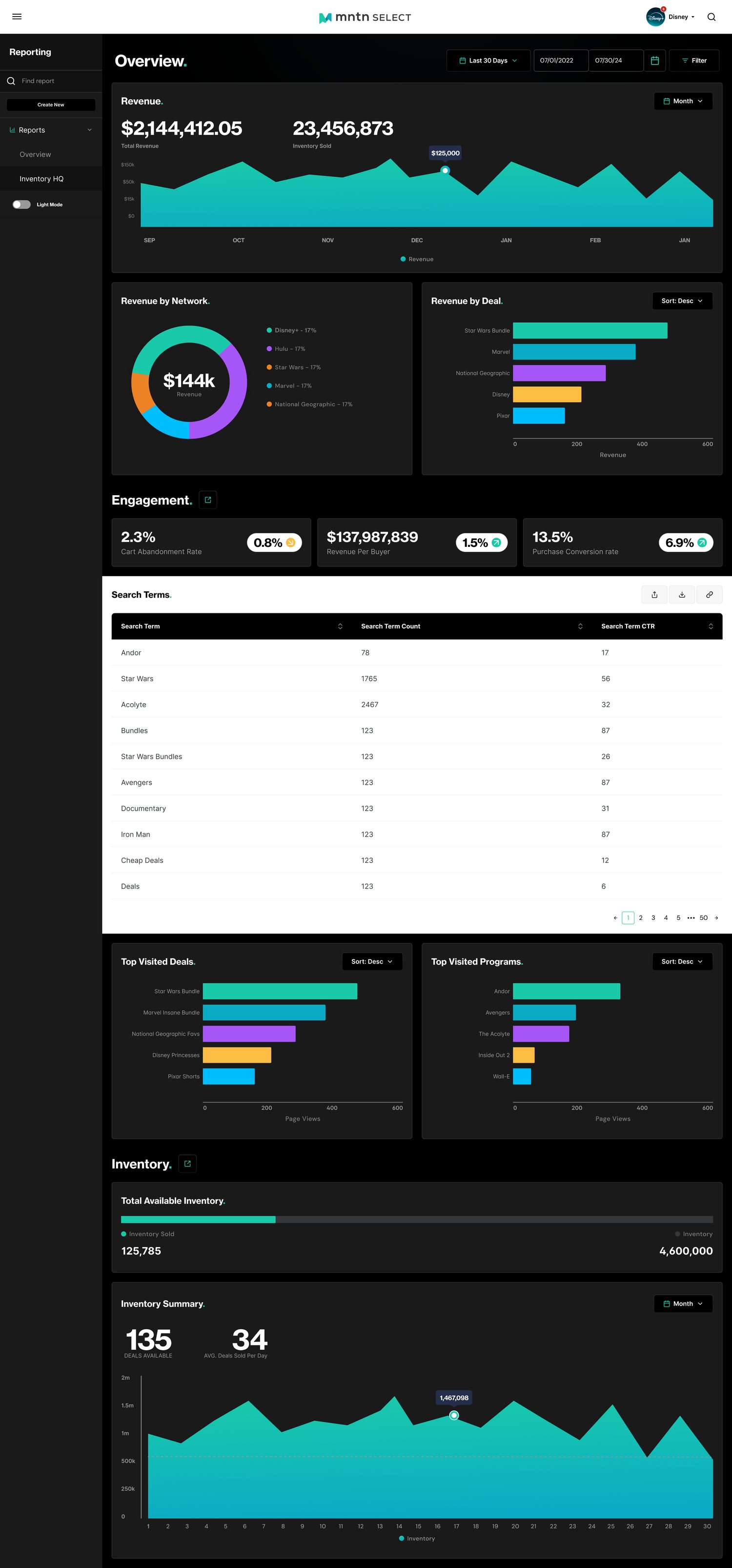
A dark reporting overview shows revenue, revenue by network and by deal, engagement, search terms, top visited deals and programs, and inventory sold, with date controls and a light-mode toggle.
Why: Networks need to see what sells and what shoppers look for, so revenue sits beside engagement and inventory in one scrolling view.
I lead the design of every Select feature. As the product grew, I guided how the design system scaled to meet new feature requests and enhancements, and I oversee all of the front-end development.
When design is championed and trusted, the resulting product is easy to use, scalable, beautiful, and exciting for users.